Bar plots as Venn diagram alternatives
With this blog post, my goal is to demonstrate how scientists can to use bar charts instead of Venn diagrams to communicate empirical results in an easy-to-reproduce manner.

Venn diagrams are a type of figure that I see a lot in the published literature. While Venn diagrams are a great way to conceptualize the goal of looking for shared or unique transcriptional responses to experimental manipulations, I don’t think they are the best way to vizualize empirical data.
I searched for “Venn” in Garrett Grolemund & Hadley Wickham’s R for
Data Science book and in Claus Wilke’s
Fundamentals of Data Visualization
book, for guidance alternatives to the Venn diagram. Neither book
discusses Venn diagrams, but they both provide valuable insight into
creating bar plots. Interestingly, the R for Data Science book does use
Venn diagrams to illustrate the differences between inner_join and
full_join, so that provides some evidence that Venn diagrams are
useful for conceptualizing ideas about data.)
The UpSet plot
has gained some popularity since 2016. I’ve made a handful of UpSet
plots with upsetR. While it is
possible to modify the aesthetics of an UpSet plot, it is very
challenging to manipulate the size, shape, colors, and font to the
degree that is needed to combine many plots into one multi-panel figure
for a manuscript.
I quite like the bar charts in the UpSet plot, so I set out to
recreate them with ggplot2 and
cowplot. Here, I convert 12 Venn diagrams from published research
articles (from labs that I admire and respect) to 4 bar plots that I made with tidyverse and cowplot. I
think these bar plots are simple, flexible, effect, and reproducibility alternatives than a Venn diagram. You can explore all the code in my vennbar repository on
GitHub, and you can run the code in the cloud with Binder.
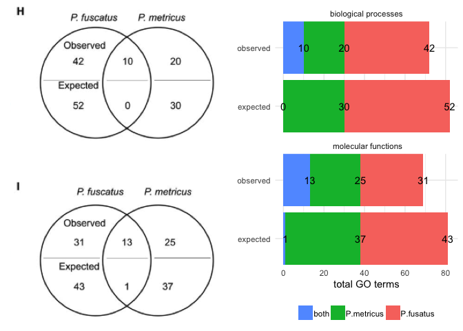
Example 1 (above) is from Cognitive specialization for learning faces is associated with shifts in the brain transcriptome of a social wasp by Berens et al. 2017. In this example, the circles do not represent a meaningful quantity. A stacked bar plot can use color, space, and text to highlight patterns in the data, which in this case appears to be a greater overlap than expected. I wanted to make the bar plot mirror the Venn diagram as closely as possible, but I changed the order of the factors so that “both” category was plotted first. This was necessary for adding text to the bar chart because the values for P. metricus and both were overlapping when I kept the “both” category in the middle. Here is the code for my bar plot alternative.
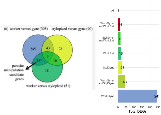
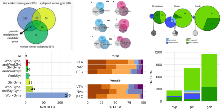
Example 2 is from Transcriptomics of an extended phenotype:
parasite manipulation of wasp social behaviour shifts expression of
caste-related genes by Geffre et
al..
As with example 1, the proportions of the circles are all equivalent, so they don’t convey any meaning
about the size of the sets they represent. The bar chart really highlights that fact
that that “worker versus gyne” (or “WorkGyne” for short) comparison
yields the most differentially expressed genes. However, that was not
the main message of the Venn diagram. The authors used an arrow an *
to highlight one particular comparison, so I used a bright red fill to
highlight the parasite manipulation candidate genes. Here is the
code
for my bar plot alternative.
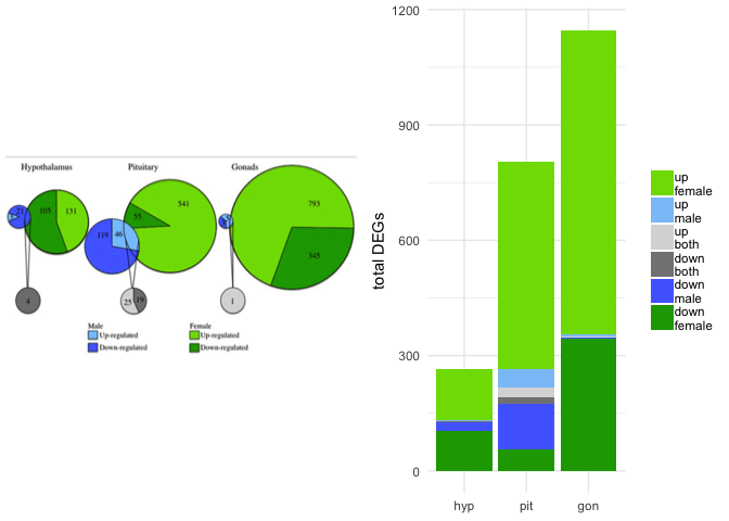
Example 3 is from Sex-biased transcriptomic response of the reproductive axis to stress by Calisi et al. 2017. This weighted Venn diagram is the highest quality Venn diagram I’ve ever seen, but it still has limitations. If you only focus on the green pies, they seem to do a good job of conveying relative size, but if you look closely, you’ll notices that the size of the grey circles is misleading. The original Venn diagram conveys information about tissue (hypothalamus, pituitary, gonad), sex (male and female), and response (up- or down-regulation), so I used facetting and a combination of stacked and side-by-side bar plot to visualize all the complexity. I think that this bar chart does a better job of conveying the magnitude of differences between the sexes and across tissues and the bias toward up-regulation of gene expression. Here is the code for my bar plot alternative, as well as a less-squished version of the bar plot.
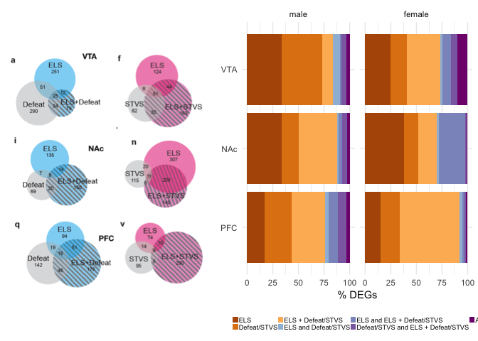
Example 4 is from Early life stress alters transcriptomic patterning across reward circuitry in male and female mice by Peña et al. 2017. Here, the Venn diagrams are also scaled, but each of the six subplots has their own scaling, so you cannot compare all six visually. Moreover, the authors report the percent of shared gene expression in the manuscript, but their Venn diagrams show counts. So, I calculated the percent of shared differentially expressed genes (%DEGs) and colored all overlapping responses in shades of purple and the unique responses in shades of orange. Now, once can spot interesting trends in the data, like increase response to early and late life stress (ELS + STVS) in the female PFC. This is something that is present but not emphasized in the Venn. Here is the code for my bar plot alternative.
So, that’s my comparison of four Venn diagrams and four possible bar plot alternatives. What do you think? Do you see the advantages? What other alternatives do you suggest? Comments welcome! (Thanks to Titus Brown, Claus, Wilke, and Victoria Farrar for insightful comments on an earlier draft.)
References
- Berens et al. 2017: http://jeb.biologists.org/content/220/12/2149
- Geffre et al. 2017: https://royalsocietypublishing.org/doi/full/10.1098/rspb.2017.0029
- Calisi et al. 2017: https://www.sciencedirect.com/science/article/pii/S0018506X17302696?via%3Dihub)
- Peña et al. 2019: https://www.biorxiv.org/content/10.1101/624353v1