Using R to analyze and visualize tweets from SACNAS
This blog post explains how I use R to analyze Twitter data to gain a better understanding of who is tweeting at conferences and how impactful those tweets are. I hope you find this explanation useful and that it inspires you to conduct your own analyses of Twitter data.
Organizations are increasingly using Twitter data as metrics for success, and they sometimes pay lots of money for this kind of analysis. I’ve been using R to analyze tweets at conferences ever since I read François Michonneau’s blog post about analyzing tweets at CarpentryCon. Usually, I do this analysis for fun, but this year my goal was to collect data that my colleagues at UC Davis could as evidence that our presence our social media efforts at SACNAS were having a quantifiable impact.
In this blog post, I’ll explain how I use R to analyze and visual twitter data. I’ve written it like a tutorial and have included all the code you need to reproduce the analysis, or you can also view the code as an R script in this gist. I hope these will be valuable resources that you can modify and reuse.
Step 1. Get data
rtweet is an R package that collects Twitter data via Twitter’s REST Application Program Interfaces (API). The function “search_tweets” returns Twitter statuses that match a user-provided search query from the past 6-9 days. There is a limit to how many statuses you can return on a given day, so if you need to collect more than 18,000 statuses, set “retryonratelimit” to TRUE. Sometimes I like to call the API multiple times a day, so I set the number of statuses to return to a number slightly above how many I expect to be returned. Here, I set “n=2000”`” and the total number of statuses returned was about 1400 tweets and retweets.
For this analysis, I searched for all tweets UC Davis-related tweets (#ThinkBigDiversity) at the SACNAS conference (#2019SACNAS) by setting the query to “2019sacnas AND thinkbigdiversity”. When I learned that one of my colleagues forgot to use the #ThinkBigDiversity hashtags a few times, I added his twitter handle, TTLFilms, to the query with an OR statement. At this point my code looks like this:
library(rtweet)
statuses <- search_tweets('2019sacnas AND thinkbigdiversity OR TTLFilms', n=2000)
This returns a very large data frame that has a lot of useful information, but I mostly only interested in original tweets, who’s tweeting, the content of the tweet, the number of retweets, and the number of favorites. I use the tidyverse package to select the columns and rows of interest to create a “slim” data frame that is a little easier to work with because of its smaller size.
library(tidyverse)
statusesslim <- statuses %>%
  filter(is_retweet == "FALSE") %>% # get original tweets
  select(screen_name,  retweet_count, favorite_count, text) %>% # columns of interest
  arrange(desc(favorite_count))    # order by most favorited

head(statusesslim)

## # A tibble: 6 x 4
##   screen_name   retweet_count favorite_count text
##   <chr>                 <int>          <int> <chr>
## 1 BeccaCalisi             186            194 "We’re hiring at @ucdavis! Li…
## 2 RogersLabUCD             16            135 Representing! This is what a …
## 3 BeccaCalisi               9             93 "Is it just me, or are y’all …
## 4 alexcr_1                  7             91 "I can’t even explain how exc…
## 5 LajoyceMboni…            11             81 "All the attendees at #2019SA…
## 6 MCalderonDeL…            14             75 "Science and culture go hand …
Step 2. Calculate summary statistics
Now that we have the data, we can start to look at some metrics. I use nrow() to calculate the total number of original tweets.
nrow(statusesslim)

## [1] 472
Then, I use colSums() to calculate the total number of retweets and favorites colSums() only works on data frames or Tibbles that are numeric, so I use select() to pick my columns of interest.
statusesslim %>%
  select(retweet_count,favorite_count) %>%
  colSums()

##  retweet_count favorite_count
##            963           6258
This tells me that about 500 original tweets were retweet about 1000 times and favorited about 7000 times, or that on average, each tweet got 2 retweets and a little more than 10 favorites. However, I know that some tweeters have a large audience and get lots of retweets while others are new to Twitter and are still growing there audience, so I use group_by() and summarize() to create a new data frame called “original” that contains information about the total tweets, favorites, retweets, average favorites, and average retweets for each Twitter user that tweeted at least 3 tweets that matched the query.
original <- statusesslim %>%
group_by(screen_name) %>%
summarize(n_tweets = n(),
n_fav = sum(favorite_count),
n_rt = sum(retweet_count),
mean_fav = round(mean(favorite_count), digits = 1),
mean_rt = round(mean(retweet_count), digits = 1)) %>%
filter(n_tweets >= 3) %>%
arrange(desc(n_fav))
head(original)
## # A tibble: 6 x 6
## screen_name n_tweets n_fav n_rt mean_fav mean_rt
## <chr> <int> <int> <int> <dbl> <dbl>
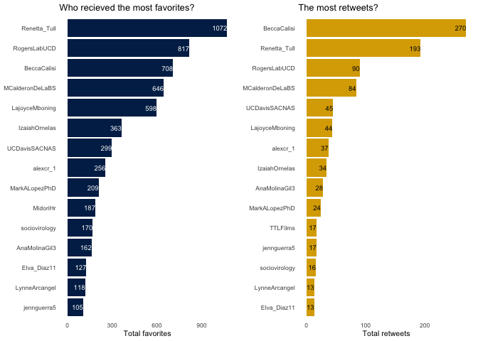
## 1 Renetta_Tull 55 1072 193 19.5 3.5
## 2 RogersLabUCD 39 817 90 20.9 2.3
## 3 BeccaCalisi 14 708 270 50.6 19.3
## 4 MCalderonDeLaBS 41 646 84 15.8 2
## 5 LajoyceMboning 75 598 44 8 0.6
## 6 IzaiahOrnelas 32 363 34 11.3 1.1
Step 3. Visualize data
One thing I’ve started recently doing is first creating a personalized theme that I can add to each plot for a unified look. I highly recommend doing this! Depending on how much you modify your theme, it may or may not save you a lot of total lines of code, but it ensures that all your figures always have all your favorite custom settings. I like to use theme_minimal() with font size 8 and no gridlines. (Note: for some reason, custom themes don’t work with ts_plot(), so I manually adjust the theme.)
mytheme <- function(){
  theme_minimal(base_size = 8) +
  theme(panel.grid = element_blank())
}
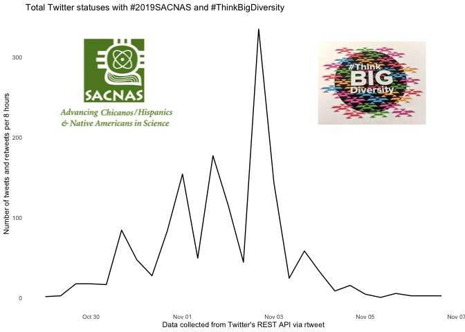
I also like to add images to plots with magick and cowplot. I switch between two methods depending on how hard it is to position the image exactly where I want it on the plot. I prefer to read images from URLs rather than from file because this makes my analysis pipeline easier to reproduce and reuse. Be patient when you run the code for plots with images because they take longer to load.
library(magick)
library(cowplot)

img1 <- image_read("http://www.gradpost.ucsb.edu/images/default-source/default-album/sacnas.jpg?sfvrsn=1")
img2 <- image_read("https://pbs.twimg.com/media/EHbxW7vU0AAnWhZ?format=jpg&name=small")

img <- image_read("https://pbs.twimg.com/media/EIPMxsyWwBMdsHQ?format=jpg&name=4096x4096")
rast <- grid::rasterGrob(img, interpolate = T)
This first plot uses a function from the rtweets package called ts_plot() to visualize the frequency of tweets over a specified interval of time. I always start with this image because it show when data was collected. This conference took place on Oct 30- November 2, but tweets were collected from Oct 28 - Nov 6.
tweetsovertime <- ts_plot(statuses, "8 hour") +
  #theme(mytheme) +
  ggplot2::labs(y = "Number of tweets and retweets per 8 hours",
                x = "Data collected from Twitter's REST API via rtweet",
                title = "Total Twitter statuses with #2019SACNAS and #ThinkBigDiversity") +
  theme_minimal(base_size = 8) +
  theme(panel.grid = element_blank())

ggdraw(tweetsovertime) +
   draw_image(img1, scale = 0.3, x = -0.25, y = 0.25) +
   draw_image(img2, scale = 0.25, x = 0.3, y = 0.25)
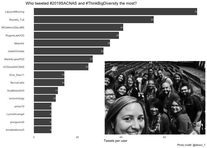
Next, I examine who is live-tweeting the most by plotting the total number of tweets per user. I switch the x and y axes so that it’s easier to read the names, and I reorder the axis so that the names are presented in descending order rather than alphabetical order. I also filter the data to the top 15 users for each of the plots rather than showing all users to ensure that the axes are always readable. I use geom_text to label the bars with the value. I like to use school colors if I can, so I encourage you to play around with the colors to match an affiliation. I add an explanatory subtitle to give a sense of what questions can be answered with this plot.
original %>% top_n(15, n_tweets) %>%
  ggplot() +
  geom_bar(aes(x = reorder(screen_name, n_tweets), y = n_tweets),
           stat = "identity", fill = "#505050") +
  geom_text(aes(label = n_tweets, y = n_tweets, x = screen_name),
            hjust=1, size = 2, color = "#E1E9E8") +
  labs(x = NULL, y = "Tweets per user",
       title = "Who tweeted #2019SACNAS and #ThinkBigDiversity the most?",
       caption = "Photo credit: @alexcr_1")  +
  coord_flip() +
  mytheme() +
  annotation_custom(rast, ymin = 32.5, ymax = 80, xmin = -7)

Then, I examine which tweeters gained the most favorites or the most retweets for all of their tweets combined. I use the package cowplot and the function plot_grid() to place the two plots side by side.
library(cowplot)

a <- original %>% top_n(15, n_fav) %>%
  ggplot() +
  geom_bar(aes(x = reorder(screen_name, n_fav), y = n_fav),
           stat = "identity", fill = "#002855") +
  geom_text(aes(label = n_fav, y = n_fav, x = screen_name),
            hjust=1, size = 2.5, color = "white") +
  labs(x = NULL, y =  "Total favorites", title = "Who recieved the most favorites?") +
  coord_flip() +
  mytheme()

b <- original %>% top_n(15, n_rt) %>%
  ggplot() +
  geom_bar(aes(x = reorder(screen_name, n_rt), y = n_rt),
            stat = "identity", fill = "#DAAA00") +
  geom_text(aes(label = n_rt, y = n_rt, x = screen_name),
            hjust=1, size = 2.5, color = "black") +
  labs(x = NULL, y  = "Total retweets", title = "The most retweets?") +
  coord_flip() +
  mytheme()

plot_grid(a,b)
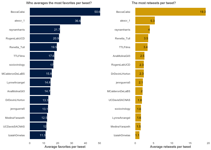
Finally, I explore the average number of retweets and favorites per tweet. I like this metric because it highlights some of the users who tweeted less frequently but were tweeting things that resonated with a large audience.
c <- original %>% top_n(15, mean_fav) %>%
  ggplot() +
  geom_bar(aes(x = reorder(screen_name, mean_fav), y = mean_fav),
           stat = "identity", fill = "#002855") +
  geom_text(aes(label = mean_fav, y = mean_fav, x = screen_name),
            hjust=1, size = 2.5, color = "white") +
  labs(x = NULL, y = "Average favorites per tweet",
       subtitle = "Who averages the most favorites per tweet?")  +
  coord_flip() +
  mytheme()


d <- original %>% top_n(15, mean_rt) %>%
  ggplot() +
  geom_bar(aes(x = reorder(screen_name, mean_rt), y = mean_rt),
           stat = "identity", fill = "#DAAA00") +
  geom_text(aes(label = mean_rt, y = mean_rt, x = screen_name),
            hjust=1, size = 2.5, color = "black") +
  labs(x = NULL, y = "Average retweets per tweet", subtitle = "The most retweets per tweet?") +
  coord_flip() +
  mytheme()


plot_grid(c,d)
Bonus: Examine retweets to look for outreach
At this point in my analysis, I reached out to a group of community managers and asked what additional metrics I should investigate. Stefanie Butland asked if I could assess which retweets came from people who were not at the conference. Given that there were over 5000 attendees, this seemed too daunting of a task; however, I thought it would be feasible and meaningful to analyze which retweets were from people not associated with UC-Davis. This “outreach” analysis would give me a sense of which tweets reached the broadest audience because they were retweeted by people outside our core network.
To do this, I first created a list of all the Twitter handles of students, faculty, and staff at UC Davis. I might have missed a few, but I think it’s fairly comprehensive. Then, I created two data frames, one with the total retweets (including quoted retweets) and one with retweets from outside UC Davis. The columns are a little confusing, in my opinion, because “screen_name” refers to the person who retweets a tweet while “retweet_screen_name” refers to the person who wrote the original tweet.
The total rows in each data frame are equivalent to the total retweets, so I divided the non-UC Davis retweets by the total and concluded that about 60% of our retweets were made by people who aren’t at UC Davis. I think this is good evidence that our tweets reached a large audience and had a broad impact.
foksatUCDavis <- c("alexcr_1", "Renetta_Tull", "RogersLabUCD",
                   "AnaMolinaGil3","MarkALopezPhD", "BeccaCalisi",
                   "LajoyceMboning",  "Elva_Diaz11", "ctitusbrown",
                   "UCDavisSACNAS", "raynamharris", "TTLFilms", "vdiazochoa" ,
                   "BowyerJacques", "MCalderonDeLaBS", "sociovirology",
                   "jennguerra5", "LynneArcangel", "MidoriHr", "IzaiahOrnelas",
                   "Graham_Coop", "UCDavisBiotech", "UCDavisGlobal", "UCDavisCOE",
                   "UCDavisGrad", "UCDMicrobiome", "vs_farrar", "yggdrasil13751",
                   "MedinaYarazeth", "phylogenomics", "ucdavisbiology")

retweets_total <- statuses %>%
  filter(is_retweet == "TRUE" | is_quote == "TRUE") %>%
  select(screen_name, retweet_screen_name, retweet_count, text)

retweets_nonucd <- statuses %>%
  filter(is_retweet == "TRUE" | is_quote == "TRUE") %>%
  filter(!screen_name %in% foksatUCDavis) %>%
  select(screen_name, retweet_screen_name, retweet_count, text)

nrow(retweets_nonucd) / nrow(retweets_total) * 100

## [1] 59.14179
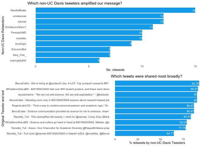
Even though I’m not interested in using Twitter for marketing or identifying influencers, I imagine that some people are. In this final visualization, the top panel shows which non-UC Davis Tweeters retweeted us the most. I think this is an indicator of people who have shared values and might be valuable influencers. The bottom panel shows which tweets reached the broadest audience, which could be good tweets to promote if you have the budget for advertising. In this case, a tweet announcing jobs at UC Davis was by far the most retweeted and favorited tweet of the entire twitter campaign.
e <- retweets_nonucd %>%
    group_by(screen_name) %>%
    summarize(n_rt = n()) %>%
    arrange(desc(n_rt))  %>%
  head(10) %>%
  ggplot() +
  geom_bar(aes(x = reorder(screen_name, n_rt), y = n_rt),
            stat = "identity", fill = "#00acee") +
  geom_text(aes(label = n_rt, y = n_rt, x = screen_name),
            hjust=1, size = 2.5, color = "white") +
  labs(x = "Non-UC Davis Retweeters", y  = "No. retweets",
       title = "Which non-UC Davis tweeters amplified our message?") +
  coord_flip() +
  mytheme()


f <- retweets_nonucd %>%
  group_by(retweet_count,retweet_screen_name, text) %>%
  summarize(n_rt = n()) %>%
  arrange(desc(n_rt))  %>%
  mutate(who.what = paste(retweet_screen_name, text, sep = " - "),
         textslim = substr(who.what, start=1, stop=80),
         percent = round((n_rt / retweet_count *100),2)) %>%
  head(10) %>%
  ggplot() +
  geom_bar(aes(x = reorder(textslim, percent), y = percent),
            stat = "identity", fill = "#00acee") +
    geom_text(aes(label = percent, y = percent, x = textslim),
            hjust=1, size = 2.5, color = "white") +
  labs(x = "Original Tweeter and text", y  = "% retweets by non-UC Davis Tweeters",
       title = "Which tweets were shared most broadly?") +
  coord_flip() +
  mytheme()

plot_grid(e,f, nrow = 2)
Conclusion
So, that’s how I use R to analyze Twitter data to gain a better understanding of who is tweeting and how impactful those tweets are. I hope you found this explanation useful and that it inspires you to conduct your own #rstats analysis of Twitter data. Feel free to add suggestions or feedback in the comments below.
Acknowledgments
This blog post was inspired by a conversation about Twitter analytics in
the Honolulu airport with Yaihara
Fortis,
Laurel Allen, and Lauren
Esposito. I want to thank my
advisor, Rebecca Calisi
Rodriguez, for enthusiastically
providing financial support for me to attend SACNAS and to Tim
McConville, Alexandra
Colón-Rodríguez, Jen
Guerra, and Ana Molina
Gil for being awesome teammates
as we worked on a documentary about the conference. I’m thankful that
Renetta Tull brought together
40 faculty members, students, postdoc and staff from across the UC Davis
campus to work together to promoting diversity in STEM through Twitter.
I am grateful to Victoria Farrar for
testing the R code and to Stefanie
Butland for suggesting new
analyses. Thank you for reading :)