Using recount3 to query public RNA-seq datasets
The recount3 package enables access to a large amount of uniformly processed RNA-seq data from humans and mice. This tool makes it easy to reproduce published analyses or create a meta-analysis from multiple datasets. In this post, I provide the code I used to explore human heart data from the Gene Expression Tissue Database and to reproduce an analysis of mouse hippocampus data from the Sequence Read Archive.
As part of my postdoc, I’m helping develop and maintain online training materials for the NIH Common Fund. I’ve been looking for a small Common Fund RNA-seq dataset data that could be used to teach the basics of R and RNA-seq. I recently discovered recount3, an R package that queries RNA-seq datasets from both the Genotype-Tissue Expression (GTEx) Project (a Common Fund Program) and the Sequence Read Archive (SRA). recount3 provides quick and easy data access, allowing users to find datasets for novel exploratory analysis, hypothesis-driven testing, or for reproducing published studies. The recount3 quick start tutorial is very helpful for getting started. In this blog post, I describe the workflow I used to get, wrangle, and analyze human heart data from GTEx for exploratory purposes and mouse hippocampus data from SRA to reproduce some findings from a published paper.
I did all of this work in R using the packages listed below. The scripts for this blog post are here.
library(tidyverse)
library(recount3)
library(biomaRt)
library(Rtsne)
library(DESeq2)
library(cowplot)
library(ggpubr)
Exploratory analysis of human heart RNA-seq data from the Gene Expression Tissue (GTEx) Project
When using recount3 to obtain RNA-seq data, the first step is to get a data frame of all the available human and/or mouse projects using the command available_projects().
gtex_projects <- available_projects(organism = "human", file_source == "gtex")
head(gtex_projects)

##     project organism file_source     project_home project_type n_samples
## 1 SRP107565    human         sra data_sources/sra data_sources       216
## 2 SRP149665    human         sra data_sources/sra data_sources         4
## 3 SRP017465    human         sra data_sources/sra data_sources        23
## 4 SRP119165    human         sra data_sources/sra data_sources         6
## 5 SRP133965    human         sra data_sources/sra data_sources        12
## 6 SRP096765    human         sra data_sources/sra data_sources         7
Then, you can use the subset() function to create a data frame with information about the projects of interest. For this example, I’m interested in exploring the RNA-seq data from human hearts that was collected as part of the GTEx project.
gtex_heart <- subset(human_projects, project == "HEART"  &
                       file_source == "gtex" & project_type == "data_sources" )
gtex_heart

##      project organism file_source      project_home project_type n_samples
## 8681   HEART    human        gtex data_sources/gtex data_sources       942
Then, I create a RangedSummarizedExperiment (RSE) with create_rse().
rse_gtex_heart <- create_rse(gtex_heart)
rse_gtex_heart

## class: RangedSummarizedExperiment
## dim: 63856 942
## metadata(8): time_created recount3_version ... annotation recount3_url
## assays(1): raw_counts
## rownames(63856): ENSG00000278704.1 ENSG00000277400.1 ...
##   ENSG00000182484.15_PAR_Y ENSG00000227159.8_PAR_Y
## rowData names(10): source type ... havana_gene tag
## colnames(942): GTEX-X261-0926-SM-3NMCY.1 GTEX-X4XX-1126-SM-3NMBY.1 ...
##   GTEX-1L5NE-0426-SM-E9TIX.1 GTEX-1NV8Z-1526-SM-DTX8X.1
## colData names(198): rail_id external_id ... recount_seq_qc.errq
##   BigWigURL
From here, the next steps are to extract the sample in colData and the raw_counts from the assays. (The raw counts can be transformed using transform_counts()). The rownames of the colData should match the colnames of the countData and they should be the same length (in this case, 942).
colData <- colData(rse_gtex_heart) %>% as.data.frame()
countData <- assays(rse_gtex_heart)$raw_counts %>% as.data.frame()

head(rownames(colData) == colnames(countData))

## [1] TRUE TRUE TRUE TRUE TRUE TRUE

dim(colData)

## [1] 942 198

dim(countData)

## [1] 63856   942
The colData contains a lot of information about the original experimental design as well as some quality control measures from recount3. This information can be used to filter out samples that are not of interest. This project included both mRNA sequencing of genes and miRNA sequencing of micro RNAs. I want to focus on genes, so I will filter out the miRNA files. I’ll also filter out any files that don’t have an accession number linking the source files. Then I selected only the columns with sample identifiers or information about the source tissue.
colData <-  colData %>%
  filter(gtex.run_acc != "NA",
         gtex.smnabtcht != "RNA isolation_PAXgene Tissue miRNA") %>%
  dplyr::select(external_id, study, gtex.run_acc,
                gtex.age, gtex.smtsd)
head(colData)
##                                             external_id study gtex.run_acc gtex.age               gtex.smtsd
##   GTEX-12ZZX-0726-SM-5EGKA.1 GTEX-12ZZX-0726-SM-5EGKA.1 HEART   SRR1340617    40-49 Heart - Atrial Appendage
##   GTEX-13D11-1526-SM-5J2NA.1 GTEX-13D11-1526-SM-5J2NA.1 HEART   SRR1345436    50-59 Heart - Atrial Appendage
##   GTEX-ZAJG-0826-SM-5PNVA.1   GTEX-ZAJG-0826-SM-5PNVA.1 HEART   SRR1367456    50-59   Heart - Left Ventricle
##   GTEX-11TT1-1426-SM-5EGIA.1 GTEX-11TT1-1426-SM-5EGIA.1 HEART   SRR1378243    20-29 Heart - Atrial Appendage
##   GTEX-13VXT-1126-SM-5LU3A.1 GTEX-13VXT-1126-SM-5LU3A.1 HEART   SRR1381693    20-29   Heart - Left Ventricle
##   GTEX-14ASI-0826-SM-5Q5EB.1 GTEX-14ASI-0826-SM-5Q5EB.1 HEART   SRR1335164    60-69 Heart - Atrial Appendage
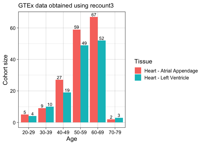
Now, we can use ggplot2 to show how many samples for each biological condition.
colData %>%
      group_by(gtex.age, gtex.smtsd) %>%
      summarise(cohort_size = length(gtex.age)) %>%
      ggplot(aes(x = gtex.age,  y = cohort_size, fill = gtex.smtsd)) +
      geom_bar(stat = "identity", position = "dodge") +
      labs(x = "Age", y = "Cohort size", fill = "Tissue",
           subtitle = "GTEx data obtained using recount3 ") +
      theme_linedraw(base_size = 15) +
      geom_text(aes(label = cohort_size),
                position = position_dodge(width = .9),
                vjust = -0.25)
Most RNA-seq pipelines require that the countData be in a “wide” format where each sample is a column and each gene is a row. However, many R tools prefer data in the long format. I like to create a countData_long file that can be easily subset by tissue and or gene for quick plotting.
I prefer to search genes by their common name rather than their Ensemble identifier, so I create a file called gene_info and I combine this with my countData_long for quickly plotting count data for genes of interest.
ensembl <- useEnsembl(biomart="ensembl", dataset="hsapiens_gene_ensembl")
gene_info <- getBM(attributes=c('ensembl_gene_id','hgnc_symbol'),
mart = ensembl) %>%
mutate_all(na_if, "") %>%
drop_na(.) %>%
unique(.) %>%
mutate(ensembl_gene_id = paste0(ensembl_gene_id, ".1", sep = ""))
head(gene_info)
## ensembl_gene_id hgnc_symbol
## 1 ENSG00000210049.1 MT-TF
## 2 ENSG00000211459.1 MT-RNR1
## 3 ENSG00000210077.1 MT-TV
## 4 ENSG00000210082.1 MT-RNR2
## 5 ENSG00000209082.1 MT-TL1
## 6 ENSG00000198888.1 MT-ND1
countData_long <- countData %>%
mutate(ensembl_gene_id = rownames(.)) %>%
pivot_longer(-ensembl_gene_id,
names_to = "external_id", values_to = "counts") %>%
inner_join(gene_info, .,by = "ensembl_gene_id") %>%
full_join(colData, ., by = "external_id") %>%
arrange(desc(counts))
head(countData_long)
## external_id study gtex.run_acc gtex.age gtex.smtsd
## 1 GTEX-14C5O-1326-SM-5S2UW.1 HEART SRR1321283 60-69 Heart - Left Ventricle
## 2 GTEX-ZYT6-1726-SM-5E44P.1 HEART SRR1454522 30-39 Heart - Left Ventricle
## 3 GTEX-1313W-1426-SM-5KLZU.1 HEART SRR1399990 50-59 Heart - Left Ventricle
## 4 GTEX-13X6K-1826-SM-5O9CR.1 HEART SRR1401446 60-69 Heart - Left Ventricle
## 5 GTEX-13NYB-0226-SM-5N9G4.1 HEART SRR1507229 40-49 Heart - Left Ventricle
## 6 GTEX-14A5I-1226-SM-5NQBW.1 HEART SRR1430420 50-59 Heart - Left Ventricle
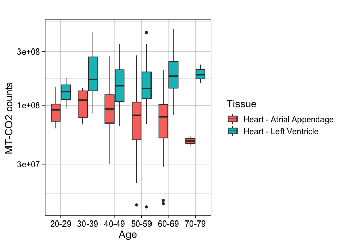
## ensembl_gene_id hgnc_symbol counts
## 1 ENSG00000198712.1 MT-CO2 477387343
## 2 ENSG00000198712.1 MT-CO2 443781897
## 3 ENSG00000198712.1 MT-CO2 441191589
## 4 ENSG00000198712.1 MT-CO2 355103823
## 5 ENSG00000198712.1 MT-CO2 349215114
## 6 ENSG00000198712.1 MT-CO2 345382718
countData_long %>%
filter( hgnc_symbol == "MT-CO2") %>%
ggplot(aes(x = gtex.age, y = counts,
fill = gtex.smtsd)) +
geom_boxplot() +
scale_y_log10() +
labs(y = 'MT-CO2 counts', x = "Age", fill = "Tissue") +
theme_linedraw(base_size = 15) +
scale_y_continuous(labels = scales::label_number_si())
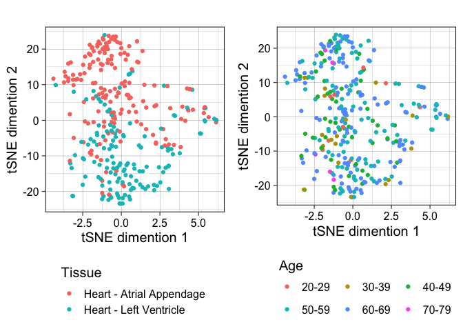
In addition to looking at specific genes, I always like to do a dimension reduction analysis to see which variable contributes to the most variation in the dataset. I could use the colData and countData, but since countData_long contains the most pertinent variables, I widen and then separate it into two matrices for a tSNE analysis.
countData_long_wide <- countData_long %>%
  dplyr::select(-hgnc_symbol) %>%
  pivot_wider(id_cols = external_id:gtex.smtsd,
              names_from = ensembl_gene_id,
              values_from = counts,
              values_fn = sum)

tsne_samples <- countData_long_wide[ ,1:5]
tsne_data <- countData_long_wide[ ,6:15225]

tsne_results <- Rtsne(tsne_data, perplexity=30, check_duplicates = FALSE)

tsne_results_samples <- as.data.frame(tsne_results$Y) %>% cbind(tsne_samples, .)
head(tsne_results_samples)

    ##                  external_id study gtex.run_acc gtex.age             gtex.smtsd	V1       V2
    ## 1 GTEX-14C5O-1326-SM-5S2UW.1 HEART   SRR1321283    60-69 Heart - Left Ventricle	14.90660 17.31216
    ## 2  GTEX-ZYT6-1726-SM-5E44P.1 HEART   SRR1454522    30-39 Heart - Left Ventricle	14.80625 17.29054
    ## 3 GTEX-1313W-1426-SM-5KLZU.1 HEART   SRR1399990    50-59 Heart - Left Ventricle	14.95268 17.19092
    ## 4 GTEX-13X6K-1826-SM-5O9CR.1 HEART   SRR1401446    60-69 Heart - Left Ventricle	14.39209 16.02846
    ## 5 GTEX-13NYB-0226-SM-5N9G4.1 HEART   SRR1507229    40-49 Heart - Left Ventricle	12.06073 18.42883
    ## 6 GTEX-14A5I-1226-SM-5NQBW.1 HEART   SRR1430420    50-59 Heart - Left Ventricle	13.52264 17.09487
Now I can plot the samples along tSNE dimensions 1 and 2 and color by tissue and age to see which explains most of the variation. In this case, the samples separate along dimension 2 by tissue but not by age.
One of my favorite RNA-seq analysis tools is DESeq2. DESEq2 does not like to have dashes in variable names, so I use gsub to replace - with _. Also, DESeq2 performs best with 100 samples or less. I like to use it on experiments with a 2 x 2 design (e.g. ~ treatments * condition). So, I do some data wrangling to just focus on two age groups.
# replace dashes with underscores for deseq
names(countData) <- gsub(x = names(countData), pattern = "\\-", replacement = "_")
rownames(colData) <- gsub(x = rownames(colData) , pattern = "\\-", replacement = "_")
colData$gtex.age <- gsub(x = colData$gtex.age , pattern = "\\-", replacement = "_")
colData$gtex.smtsd <-  gsub(x = colData$gtex.smtsd , pattern = "\\-", replacement = "")
colData$gtex.smtsd <-  gsub(x = colData$gtex.smtsd , pattern = " ", replacement = "")

# check that rows and samples match
head(rownames(colData) == colnames(countData))

## [1] TRUE TRUE TRUE TRUE TRUE TRUE

# subset to 100 for deseq

colDataSlim <- colData %>% filter(gtex.age  %in% c("30_39","40_49"))
savecols <- as.character(rownames(colDataSlim)) #select the rowsname
savecols <- as.vector(savecols) # make it a vector
countDataSlim <- countData %>% dplyr::select(one_of(savecols))

# check that rows and samples match
head(rownames(colDataSlim) == colnames(countDataSlim))

## [1] TRUE TRUE TRUE TRUE TRUE TRUE
Now I can use DESeq2 to ask whether or not more genes are differentially expressed based on age or tissue.
dds <- DESeqDataSetFromMatrix(countData = countDataSlim,
                              colData = colDataSlim,
                              design = ~ gtex.age * gtex.smtsd)

dds <- dds[ rowSums(counts(dds)) > 1, ]  # Pre-filtering genes with 0 counts
dds <- DESeq(dds, parallel = TRUE)
vsd <- vst(dds, blind=FALSE)

res1 <- results(dds, name="gtex.age_40_49_vs_30_39",  independentFiltering = T)
sum(res1$padj < 0.05, na.rm=TRUE)
## [1] 993

res2 <- results(dds, name="gtex.smtsd_HeartLeftVentricle_vs_HeartAtrialAppendage", independentFiltering = T)
sum(res2$padj < 0.05, na.rm=TRUE)
## [1] 4256
These results indicate that 993 genes were differentially expressed between the 30- and 40- year old cohorts while 4256 genes were differentially expressed between the left ventricle and atrial appendages of the heart. This result supports the tSNE result that tissue explains more variation in the dataset than age. We can create MA plots to show the log fold change and mean expression level for each gene.
a <- ggmaplot(res1, main = expression("Age: 30-39" %->% "40-49"),
         fdr = 0.05, fc = 2, size = 0.4,
         palette = c("#B31B21", "#1465AC", "darkgray"),
         legend = "bottom", top = 1,
         ggtheme = ggplot2::theme_linedraw(base_size = 15))


b <- ggmaplot(res2, main = expression("Heart: Atrial Appendage" %->% "Left Ventricle"),
         fdr = 0.05, fc = 2, size = 0.4,
         palette = c("#B31B21", "#1465AC", "darkgray"),
         legend = "bottom", top = 1,
         ggtheme = ggplot2::theme_linedraw(base_size = 15))


p2 <- plot_grid(a,b, nrow = 1)
p2
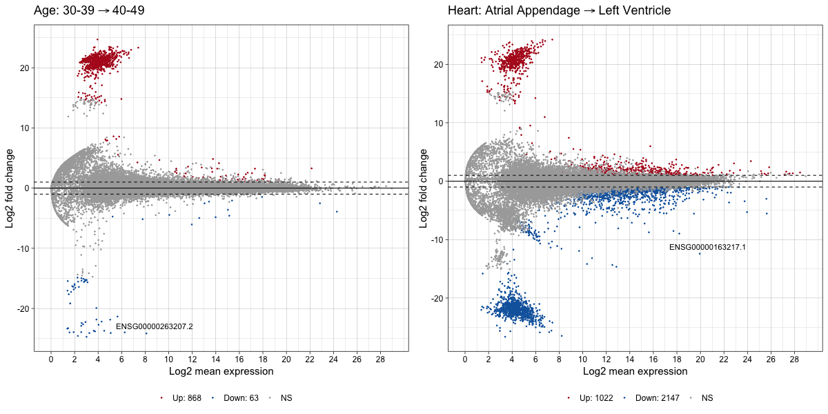
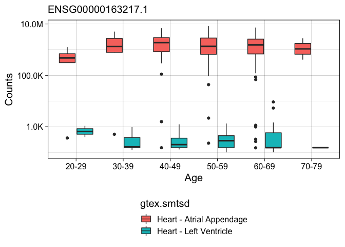
Finally, I make a box plot of one of the differently expressed genes to confirm that the the direction is correct. Here I show that “ENSG00000163217.1” (aka BMP10) is more highly expressed in the atrial appendage than the left ventricle.
countData_long %>%
  filter( ensembl_gene_id == "ENSG00000163217.1") %>%
  ggplot(aes(x = gtex.age, y = counts,
             fill = gtex.smtsd)) +
  geom_boxplot() +
  scale_y_log10(labels = scales::label_number_si(accuracy = 0.1)) +
  labs(y = 'Counts', x = "Age", subtitle = "ENSG00000163217.1") +
  theme_linedraw(base_size = 15) +
  theme(legend.position = "bottom", legend.direction = "vertical")
I like this analysis, but it was very exploratory, and I don’t know if the results are correct because the original GETex publication did not look specifically at a subset of the heart data. So, I decided to use recount3 to reproduce the findings of a published paper.
Mouse hippocampus RNA-seq data from the Sequence Read Archive (SRA)
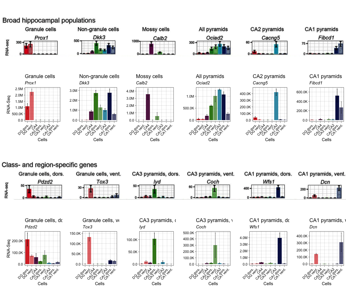
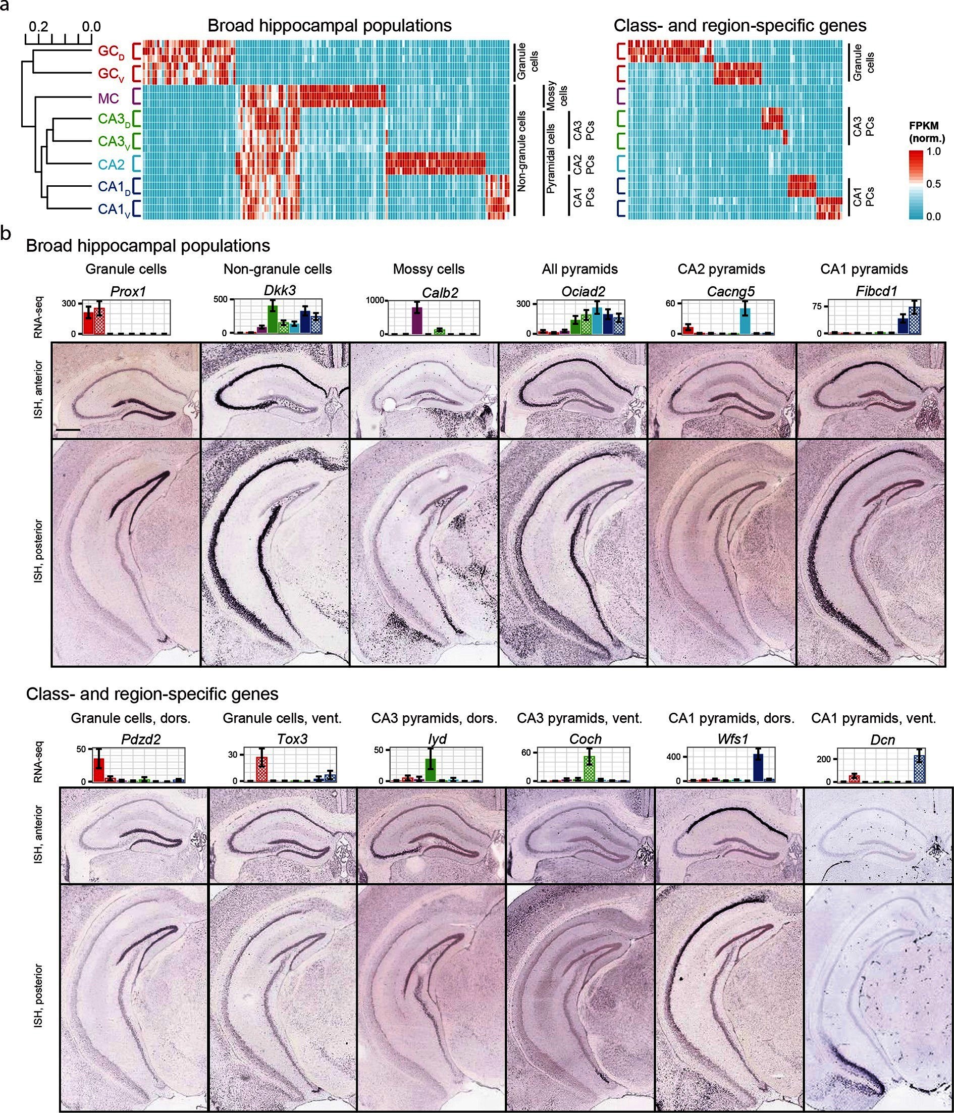
During my PhD, I studied learning and memory in the mouse hippocampus. One of my favorite papers at the time was Hipposeq: a comprehensive RNA-seq database of gene expression in hippocampal principal neurons. This paper looked at gene expression differences between the ventral and dorsal cell populations of different areas fo the hippocampus. In addition to making the data public in the SRA, they also built an interactive data portal for visualizing the expression patterns of genes or cells of interest. I believe these features make this an excellent dataset for seeing if recount3 can reproduce published results.
My first aim was to reproduce the bar plots in figure 2B. To do so, I created a file with all the available mouse projects from SRA and subset this by the SRA accession number associated with this dataset. Then I created a RangedSummarizedExperiment object and extracted the count data and sample information.
mouse_projects <- available_projects(organism = "mouse")
head(mouse_projects)

SRP066161 <- subset(mouse_projects, project == "SRP066161" )

myrse <- create_rse(SRP066161)

countData <- assays(myrse)$raw_counts %>% as.data.frame()
colData <- colData(myrse) %>% as.data.frame()
The sample and tissue information I need is in the colData frame, but I had to use the function separate() to separate multiple variables of interest that were combined into one column.
colData <-  colData %>%
      dplyr::select(external_id:sra.submission_acc, sra.experiment_title,
                    sra.run_total_bases) %>%
      separate(sra.experiment_title, into = c("GSM", "sample"), sep = " ") %>%
      separate(sample, into = c("tissue", "rep"), sep = "_")
Next, I create a file called gene_names that has both the ensemble id and the mouse gene name. Then, I lengthen the countData and join it with gene_info to create a file that can easily be subset for subsequent plotting.
ensembl <- useEnsembl(biomart="ensembl", dataset="mmusculus_gene_ensembl")
gene_info <- getBM(attributes=c('ensembl_gene_id','mgi_symbol'),
                       mart = ensembl) %>%
      mutate_all(na_if, "") %>%
      drop_na(.) %>%
      unique(.) %>%
      separate(ensembl_gene_id, into = c("ensembl_gene_id", NA), sep = "\\.")

countData_long <- countData %>%
  mutate(ensembl_gene_id = rownames(.)) %>%
  separate(ensembl_gene_id, into = c("ensembl_gene_id", NA), sep = "\\.") %>%
  pivot_longer(-ensembl_gene_id,
               names_to = "external_id", values_to = "counts") %>%
  right_join(gene_info, .,by = "ensembl_gene_id") %>%
  full_join(colData, ., by = "external_id") %>%
  arrange(desc(counts)) %>%
  mutate(tissue = factor(tissue, levels = mylevels))
head(countData_long)

    ##   external_id     study sra.sample_acc.x sra.experiment_acc sra.submission_acc
    ## 1  SRR2916042 SRP066161       SRS1161893         SRX1430868          SRA311471
    ## 2  SRR2916043 SRP066161       SRS1161892         SRX1430869          SRA311471
    ## 3  SRR2916044 SRP066161       SRS1161891         SRX1430870          SRA311471
    ## 4  SRR2916041 SRP066161       SRS1161894         SRX1430867          SRA311471
    ## 5  SRR2916037 SRP066161       SRS1161874         SRX1430863          SRA311471
    ## 6  SRR2916038 SRP066161       SRS1161873         SRX1430864          SRA311471
    ##           GSM tissue rep sra.run_total_bases    ensembl_gene_id	 mgi_symbol	counts
    ## 1 GSM1939690:    ca2   0          4907054600 ENSMUSG00000064339    mt-Rnr2	375998468
    ## 2 GSM1939691:    ca2   1          4793430300 ENSMUSG00000064339    mt-Rnr2	367971070
    ## 3 GSM1939692:    ca2   2          4714232100 ENSMUSG00000064339    mt-Rnr2	354043058
    ## 4 GSM1939689:   ca3v   2          5067517455 ENSMUSG00000064339    mt-Rnr2	340791093
    ## 5 GSM1939685:   ca3d   1          4349032200 ENSMUSG00000064339    mt-Rnr2	289314734
    ## 6 GSM1939686:   ca3d   2          4291527600 ENSMUSG00000064339    mt-Rnr2	286749929
Because I want to make 12 plots that look nearly identical, I write a function to reduce copying and pasting. I also specify the factor levels, labels, colors, and transparency values in an attempt to match the original style. I also add a screenshot of the original bar plots for easy comparison.
mylevels <- c("dgd", "dgv", "ca4", "ca3d", "ca3v", "ca2", "ca1d", "ca1v")
mylables <- c("DG dors.", "DG vent.", "CA4", "CA3 dors.", "CA3 vent.",
                  "CA2", "CA1 dors.", "CA1 vent.")
mycolors <- c("#d7322d", "#d7322d", "#612150", "#3b841e", "#3b841e",
                  "#3d98b2", "#0a1550", "#0a1550")
myalpha <- c(1, 0.7, 1, 1, 0.7, 1, 1, 0.7)

fig2b <- function(mygene, mytitle, myylab){
  p <- countData_long %>%
    filter( mgi_symbol  == mygene) %>%
    group_by(tissue) %>%
    summarize(meancounts = mean(counts),
              sdcounts = sd(counts)) %>%
    ggplot(aes(x = tissue, y = meancounts,
               fill = tissue, alpha = tissue )) +
    geom_bar(stat = "identity") +
    geom_errorbar(aes(ymin=meancounts-sdcounts,
                      ymax=meancounts+sdcounts), width=.2) +
    scale_y_continuous(labels = scales::label_number_si(accuracy = 0.1)) +
    scale_alpha_manual(values = myalpha) +
    labs(y = myylab, x = "Cells",
         subtitle = mygene, title = mytitle) +
    theme_linedraw(base_size = 15) +
    theme(legend.position = "none",
          axis.text.x = element_text(angle = 45, hjust = 1),
          plot.subtitle = element_text(face = "italic")) +
    scale_fill_manual(values = mycolors) +
    scale_x_discrete(labels = mylables)
  return(p)
}

a <- fig2b("Prox1", "Granule cells", "\nRNA-Seq")
b <- fig2b("Dkk3", "Non-granule cells", " ")
c <- fig2b("Calb2", "Mossy cells", " ")
d <- fig2b("Ociad2", "All pyramids", " ")
e <- fig2b("Cacng5", "CA2 pyramids", " ")
f <- fig2b("Fibcd1", "CA1 pyramids", " ")

B1 <- plot_grid(a,b,c, d, e, f, nrow =1, rel_widths = c(1.1,1,1,1,1,1))

g <- fig2b("Pdzd2", "Granule cells, dors.", "\nRNA-Seq")
h <- fig2b("Tox3", "Granule cells, vent.", " ")
i <- fig2b("Iyd", "CA3 pyramids, dors.", " ")
j <- fig2b("Coch", "CA3 pyramids, vent.", " ")
k <- fig2b("Wfs1", "CA1 pyramids, dors.", " ")
l <- fig2b("Dcn", "CA1 pyramids, vent.", " ")

B2 <- plot_grid(g,h,i,j,k,l, nrow =1, rel_widths = c(1.1,1,1,1,1,1))

fig_broad <- png::readPNG("../images/recount3-broad.png")
fig_broad <- ggdraw() +  draw_image(fig_broad, scale = 1)

fig_specific <- png::readPNG("../images/recount3-specific.png")
fig_specific <- ggdraw() +  draw_image(fig_specific, scale = 1)

plot_grid(fig_broad, B1, fig_specific, B2, nrow = 4)

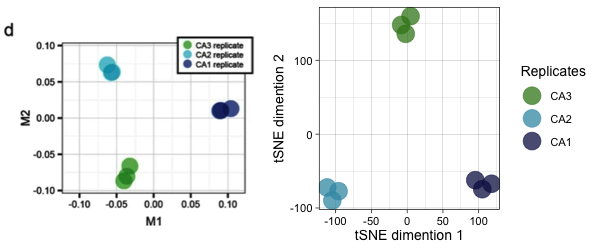
I noticed two things immediately. First, the values on the y-axes do not match. My numbers are much bigger. If you recall, I chose to work with the raw_counts rather than transform them. The authors did transform that raw counts and plotted FPKM instead, so it makes sense that the y-axes do not match. Nevertheless, the patterns of expression are very similar. Both the original and the recreated plots highlight the cell-specific expression patterns of these genes.
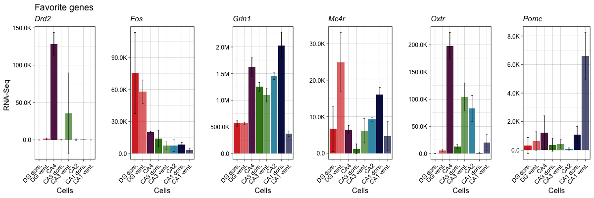
Now that I have the data in R and I have a function for plotting genes of interest, I can now do my own exploratory analysis to view the expression pattern of some of my favorite genes. You can visit the Hipposeq data portal and confirm the expression pattern of these genes or any other gene of interest.
o <- fig2b("Drd2", "Favorite genes", "RNA-Seq  ")
r <- fig2b("Fos", " ", " ")
q <- fig2b("Grin1", " ", " ")
n <- fig2b("Mc4r", " ", " ")
s <- fig2b("Oxtr", " ", " ")
m <- fig2b("Pomc", " ", " ")

p2 <- plot_grid(o,r,q,n,s,m, nrow = 1)
Finally, I can do a tSNE (or other dimension reducing) analysis to show that the CA1, CA2, and CA3 regions of the hippocampus have unique expression patterns
countData_long_wide <- countData_long %>%
  filter(!str_detect(mgi_symbol, "mt|Mir")) %>%
  filter(tissue %in% c("ca3d", "ca2", "ca1d"))  %>%
  dplyr::select(-mgi_symbol) %>%
  pivot_wider(id_cols = external_id:ensembl_gene_id,
              names_from = ensembl_gene_id,
              values_from = counts,
              values_fn = sum)

tsne_data <- countData_long_wide[ ,10:50840]  %>% as.matrix(.)
tsne_samples <- countData_long_wide[ ,1:9]
tsne_results <- Rtsne(tsne_data, perplexity=2, check_duplicates = FALSE)

tsne_results_samples <- as.data.frame(tsne_results$Y) %>% cbind(tsne_samples, .)

mycolors2 <- c( "#3b841e",  "#3d98b2",  "#0a1550" )

n <- tsne_results_samples %>%
  ggplot(aes(x = V1, y = V2, color = tissue)) +
  geom_point(size = 8, alpha = 0.75) +
  labs(x = "tSNE dimention 1",
       y = "tSNE dimention 2",
       color = "Replicates") +
  scale_color_manual(values = mycolors2,
                    labels = c("CA3", "CA2", "CA1")
                    ) +
  theme_linedraw(base_size = 14)

fig_M1M2 <- png::readPNG("../images/recount3-M1M2.png")
fig_M1M2 <- ggdraw() +  draw_image(fig_M1M2, scale = 1)

plot_grid(fig_M1M2, n, rel_widths = c(1, 1.25))
In conclusion, I think recount3 is an excellent tool for quickly exploring public RNA-seq dataset. Some data wrangling is required to get the data in the proper format for downstream analyses, but a lot of time is saved by not having to download files directly to your computer before importing them into R. If I’m ever asked to peer review an RNA-seq paper, I would use this tool to test the reproducibility of the paper. I also think this could be used in the classroom setting to teach the principles of RNA-seq analysis in R.
References
- Wilks, C., Zheng, S.C., Chen, F.Y. et al. recount3: summaries and queries for large-scale RNA-seq expression and splicing. Genome Biol 22, 323 (2021). https://doi.org/10.1186/s13059-021-02533-6
- Lonsdale, J., Thomas, J., Salvatore, M. et al. The Genotype-Tissue Expression (GTEx) project. Nat Genet 45, 580–585 (2013). https://doi.org/10.1038/ng.2653
- Cembrowski M.S., Wang L., Sugino K., Shields B.C., Spruston N. Hipposeq: a comprehensive RNA-seq database of gene expression in hippocampal principal neurons (2016). eLife 2016;5:e14997 https://doi.org/10.7554/eLife.14997